Life Expectancy
Last Modified 07/01/2025 12:34:12
Share this page
Introduction
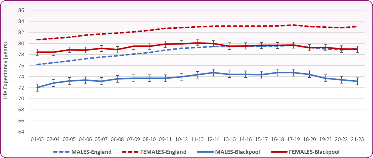
Life expectancy is one of the key indicators of health in a population. Life expectancy at birth is defined as the average number of years that a newborn is expected to live if current mortality rates continue to apply. Life expectancy for men in Blackpool is 73.1 years and for women is 78.9 years (2021-2023), both significantly lower than national averages. Men in Blackpool now have the lowest life expectancy in all of England, Scotland and Wales. There are considerable differences in life expectancy within Blackpool. Men in the least deprived areas of the town can expect to live 13.8 years longer than men in the most deprived areas. Similarly, for women this difference is 11.8 years. Not only do people in Blackpool live shorter lives, but they also spend a smaller proportion of their lifespan in good health and without disability (Figures 10 and 11).
Blackpool faces major health challenges. The early 2000s saw a steady improvement in life expectancy, dropping in 2013-15 before levelling off until 2017-19. However, the gap between Blackpool and the rest of England continues to grow (Figure 1 and 2). Life expectancy fell for both males and females from 2020 onwards, a trend also reflected nationally as the country was impacted by Covid-19. The coronavirus pandemic has led to increased mortality during 2020 and 2021 and some impact remains in the latest life expectancy reporting period 2021 to 2023.
Both men and women in Blackpool have the lowest life expectancy from birth of any local authority in England. Blackpool's male life expectancy is 5.5 years below England and 3.9 years below the North West. Female life expectancy is 3.8 years below England and 2.5 years below the North West (2021-23).
Figure 1 - Life Expectancy at Birth (2001-03 to 2021-23)
 Source: Office for National Statistics (ONS), Life expectancy at birth (years)
Figure 2 - Life expectancy at birth table (2001-03 to 2021-23)
| | MALES | FEMALES |
|---|
| | England | North West | Blackpool | England | North West | Blackpool |
|---|
| 2001-03 |
76.2 |
74.8 |
72.0 |
80.7 |
79.5 |
78.4 |
|---|
| 2002-04 |
76.5 |
75.1 |
72.9 |
80.9 |
79.7 |
78.4 |
|---|
| 2003-05 |
76.9 |
75.4 |
73.2 |
81.1 |
79.9 |
78.8 |
|---|
| 2004-06 |
77.2 |
75.7 |
73.4 |
81.5 |
80.2 |
78.8 |
|---|
| 2005-07 |
77.5 |
76.0 |
73.2 |
81.7 |
80.4 |
79.1 |
|---|
| 2006-08 |
77.8 |
76.3 |
73.6 |
81.9 |
80.5 |
78.9 |
|---|
| 2007-09 |
78.1 |
76.6 |
73.7 |
82.1 |
80.7 |
79.5 |
|---|
| 2008-10 |
78.4 |
76.9 |
73.7 |
82.3 |
81.0 |
79.5 |
|---|
| 2009-11 |
78.8 |
77.3 |
73.7 |
82.7 |
81.4 |
79.9 |
|---|
| 2010-12 |
79.1 |
77.6 |
74.0 |
82.9 |
81.6 |
79.9 |
|---|
| 2011-13 |
79.3 |
77.9 |
74.3 |
83.0 |
81.7 |
80.1 |
|---|
| 2012-14 |
79.4 |
78.0 |
74.7 |
83.1 |
81.8 |
80.0 |
|---|
| 2013-15 |
79.4 |
78.1 |
74.4 |
83.1 |
81.8 |
79.5 |
|---|
| 2014-16 |
79.5 |
78.1 |
74.4 |
83.1 |
81.7 |
79.5 |
|---|
| 2015-17 |
79.5 |
78.2 |
74.4 |
83.1 |
81.7 |
79.6 |
|---|
| 2016-18 |
79.6 |
78.3 |
74.7 |
83.2 |
81.9 |
79.6 |
|---|
| 2017-19 |
79.7 |
78.4 |
74.7 |
83.3 |
82.0 |
79.7 |
|---|
| 2018-20 |
79.3 |
77.9 |
74.4 |
83.1 |
81.7 |
79.2 |
|---|
| 2019-21 |
79.0 |
77.5 |
73.7 |
82.9 |
81.5 |
79.3 |
|---|
| 2020-22 |
78.9 |
77.3 |
73.4 |
82.8 |
81.3 |
79.0 |
|---|
| 2021-23 |
79.1 |
77.5 |
73.1 |
83.1 |
81.6 |
78.9 |
|---|
Source: Office for National Statistics, Life expectancy at birth (years)
Variation in Life Expectancy within Blackpool
There is geographical variation within Blackpool (Figures 3 and 4) with male life expectancy ranging from 68.4 years in Bloomfield, to 79.6 years in Marton - a difference of 11.2 years. Female life expectancy ranges from 72.9 years in Claremont to 82.7 years in Greenlands, a difference of 9.8 years.
Figure 3 - Male and Female Life Expectancy by Ward, Blackpool (2016 - 2020)
 Source: OHID, Local Health
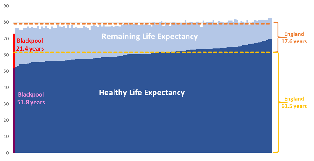
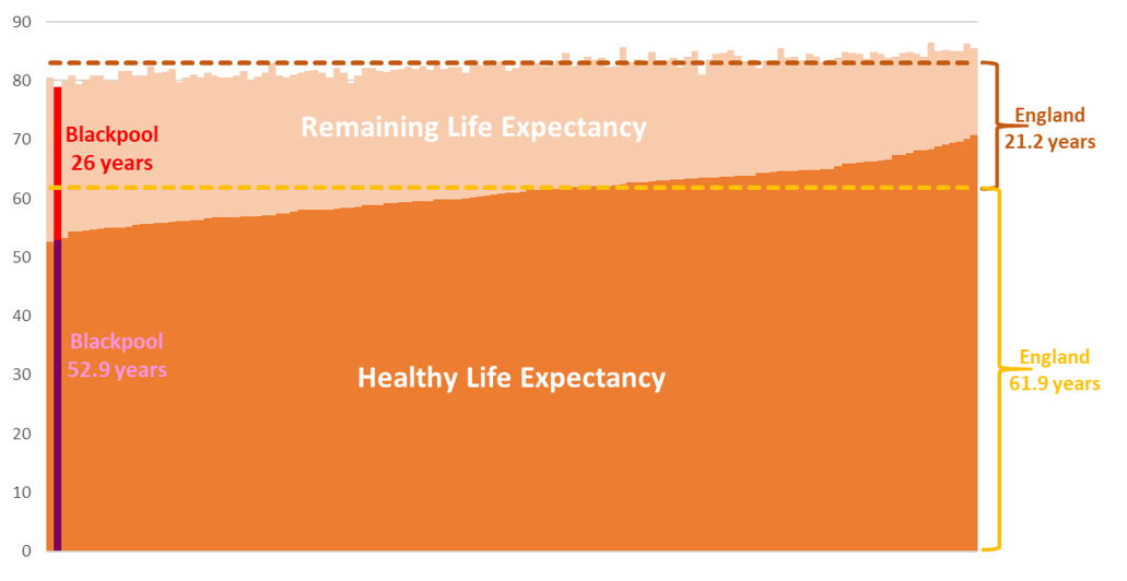
Healthy Life Expectancy
Whereas life expectancy (LE) is an estimate of how many years a person might be expected to live, healthy life expectancy (HLE) is an estimate of how many years they might live in 'good' health. The HLE estimate was calculated using self-reported prevalence of 'Good' general health collected in the Annual Population Survey. Comparisons of HLE between England and Blackpool show a greater difference than for LE alone.
-
- Blackpool has the lowest HLE for males and the second lowest for females of any UTLA in England and Wales
- HLE in Blackpool males is just 51.8 years, almost 10 years lower than England as a whole, 61.5 years
- Female HLE is 52.9 years, 9 years lower than the England average of 61.9 years
- Males in Blackpool live over a quarter (29%) of their lives in poor health, females live a third (33%) in poor health
- This compares to 22% of males and 25% of females across England living in poor health
- HLE for men in Blackpool has reduced by 3 years from 54.7 years in 2017-19 (pre-pandemic) to 51.8 years in 2021-23
- For women the reduction is 2.4 years from 55.3 years to 52.9 years over the same period. In comparison HLE for males in England reduced by 1.7 years, females reduced by 1.8 years.
From this it can be observed that residents of Blackpool live shorter lives than the national average, and furthermore spend a smaller proportion of their shorter lifespan healthy and disability-free (Figures 4 and 5). .
Figure 4 - Male Life expectancy and Healthy Life Expectancy, Upper Tier Local Authority (2021-23)
 Source: ONS, Healthy Life Expectancy
Figure 5 - Female Life expectancy and Healthy Life Expectancy, Upper Tier Local Authority (2021-23)
 Source: ONS, Healthly Life Expectancy
NB-Ward level HLE has been previously calculated using a differnt methodology, the figures and charts below will be updated once new data becomes available.
Inequalities also exist within Blackpool for healthy life expectancy and disability free life expectancy. According to 2009-2013 ward-level data, it is estimated that in Blackpool's most affluent ward (Norbreck), a man might live in 'good' health until the age of 63.3, compared to just 47.1 in the most deprived ward (Bloomfield) (Figure 6). Variation in healthy life expectancy also exists in females, with females in Bloomfield ward living on average to 51.2 in 'good' health compared to 63.8 in Stanley ward (Figure 7)1. There is also variation in the disease groups affecting more deprived areas of Blackpool, compared to England as a whole.
Figure 6 - Male Life Expectancy and Healthy Life Expectancy at Birth - Blackpool wards (2009-2013)
 Source: ONS, Healthly Life Expectancy
Figure 7 - Female Life Expectancy and Healthy Life Expectancy at Birth - Blackpool wards (2009-2013)
 Source: ONS, Healthy Life Expectancy
Understanding variations in Life Expectancy
Figure 8 shows the causes of mortality that contribute to the life expectancy gap between the 20% most deprived communities in Blackpool and the 20% least deprived communities in Blackpool, by cause of death for the COVID-19 affected period 2020-21. Deaths in younger people, especially in babies, contribute to a larger proportion of the gap, as more years of life are lost. The largest difference in life expectancy between the most and least deprived communities for males is due to deaths from external causes, that is deaths from injuries, poisonings and suicide, which account for 30.4%. For females it is circulatory diseases (including coronary heart disease and stroke) (27.3%) and cancer (20.9%). This has changed since 2015-17 when the largest difference was respiratory diseases (including flu, pneumonia and chronic lower respiratoy disease) (21.7%) followed by circulatory diseases (21.6%) and cancer (16.3%).
Figure 8 - Scarf Chart showing the breakdown of the life expectancy gap between the most deprived quintile in Blackpool and the least deprived quintile in Blackpool, by cause of death, 2020-2021 (provisional)
 Source: Office for Health Improvement and Disparities (OHID), Segment Tool
Figure 9 shows the breakdown of the life expectancy gap between Blackpool as a whole and England as a whole, by cause of death for the period 2020-2021.
For males, mortality from circulatory disease (24.1%), external causes (15.3%), and respiratory diseases are major contributors to the gap in life expectancy between Blackpool and England as a whole. For females, cancer (26.5%), digestive diseases (including alcohol-related conditions) (14.9%), and circulatory diseases (14.7%) are the main contributors.
Figure 9 - Scarf Chart showing the breakdown of the life expectancy gap between Blackpool as a whole and England as a whole, by cause of death, 2020-2021 (provisional)

Source: Office for Health Improvement and Disparities (OHID), Segment Tool
The Slope Index of Inequality in life expectancy is an indicator that measures health inequalities within a local area. The measure compares life expectancies between geographic sub-areas that have been ranked by socioeconomic deprivation. Figures 10 and 11 illustrate the change that has occurred over time in the Slope Index of Inequality in both males and females. Those in the most affluent communities within Blackpool saw increased or similar life expectancy between 2010-12 and 2018-20, whilst those in less affluent areas, particularly women, were more likely to see a reduction. The steeper angle of the slope in 2018-20 shows that inequalities of life expectancy between the most and least deprived areas have increased. For further information regarding the Slope Index of Inequality please see:
Guide to the Slope Index of Inequality
Figure 10 - Blackpool - Life Expectancy at Birth by Deprivation Deciles - Males - Slope Analysis
 Source: OHID Public Health Profiles / ONS, Life expectancy at birth by deprivation decile, 2010-12 to 2018-20
Figure 11 - Blackpool - Life Expectancy at Birth by Deprivation Deciles - Females - Slope Analysis
Source: OHID Public Health Profiles / ONS, Life expectancy at birth by deprivation decile, 2010-12 to 2018-20
[] Note: The estimated average Healthy Life Expectancy values for individual wards may be lower than those reported due to overall declines in male and female HLE across Blackpool since 2009-13. More up-to-date ward level HLE data is not currently available.